Physical Address
304 North Cardinal St.
Dorchester Center, MA 02124
Physical Address
304 North Cardinal St.
Dorchester Center, MA 02124

Video design mistakes can quickly make even the best products or services appear unprofessional. Whether you’re promoting a digital product, an online course, a business, or a social media campaign, avoiding common video design mistakes is essential for creating promotional videos that build trust and encourage viewers to take action.
Promotional videos have become one of the most effective ways to capture attention, explain products, and increase conversions. The good news is that creating professional-looking promotional videos no longer requires expensive software or years of editing experience. Modern tools like Canva, PowerPoint, and other online video editors have made video creation more accessible than ever.
However, easy access to design tools also means many creators unknowingly make video design mistakes that reduce the effectiveness of their promotions. Poor typography, inconsistent colors, cluttered layouts, distracting animations, and low-quality visuals can make even an outstanding product look cheap.
In this guide, you’ll discover eight common video design mistakes and learn practical techniques to avoid them so your promotional videos look cleaner, more professional, and more convincing.
People often form an opinion about a brand within just a few seconds of seeing its visual content.
A clean, organized, and visually consistent promotional video builds trust, communicates professionalism, and encourages viewers to continue watching. On the other hand, poorly designed videos may create the impression that the product itself lacks quality.
Good video design is not about adding more effects or flashy animations. It’s about making information easy to understand while supporting your message with clear visuals.
Avoiding common video design mistakes helps your promotions look more polished and increases the likelihood that viewers will take action.
Typography plays an important role in visual communication.
Using four or five different fonts in a single video creates inconsistency and makes the design feel unorganized.
Instead, choose one or two complementary fonts and use them consistently throughout your project.
Animations should guide attention—not distract from it.
One of the most common video design mistakes is using too many animations in a single promotional video. Applying spinning text, bouncing graphics, flashy transitions, and excessive motion effects may seem exciting, but they often overwhelm viewers and make the video look unprofessional.
Simple fade-ins, slide transitions, and subtle movement often create a more professional appearance.
Trying to place too much information on one screen is one of the most common video design mistakes.
Crowded slides force viewers to read instead of watching.
Leave enough white space so important information stands out and the design feels balanced.
Bright colors can attract attention, but using too many unrelated colors creates visual confusion.
Choose a limited color palette that aligns with your brand and maintains good contrast between text and background.
Consistent colors help videos feel more cohesive and trustworthy.
Blurry photos, stretched graphics, and pixelated icons immediately reduce perceived quality.
Always use high-resolution images and professionally designed graphics whenever possible.
Visual quality directly influences how viewers judge your business.
Videos are meant to be watched—not read like blog articles.
Long paragraphs covering the screen make viewers lose interest.
Instead, summarize key points using short headlines, bullet points, or brief supporting text while allowing visuals and narration to tell the story.
Professional promotional videos maintain consistent branding from beginning to end.
Colors, typography, logo placement, icon style, and visual tone should remain uniform throughout the presentation.
Consistency strengthens brand recognition and creates a more polished viewing experience.
A large percentage of promotional videos are watched on smartphones.
Small text, overly detailed graphics, and crowded layouts become difficult to read on smaller screens.
When designing promotional videos, always preview them on both desktop and mobile devices to ensure readability.
Avoiding this final video design mistake helps your content reach a wider audience effectively.
Improving your video design doesn’t necessarily require advanced editing skills.
Instead, focus on following a few fundamental design principles:
Small improvements in these areas can dramatically increase the overall quality of your promotional content.
If you’re interested in creating more professional marketing videos, explore our growing collection of free resources designed for content creators, entrepreneurs, freelancers, and marketers.
You’ll find practical guides, Canva templates, PowerPoint resources, digital marketing articles, and productivity tools to help you create engaging promotional content more efficiently.
You may also enjoy these related articles:
Designing promotional videos from scratch can be time-consuming. If you want to create polished marketing videos faster, consider our 120 Canva & PowerPoint Video Promotion Templates.
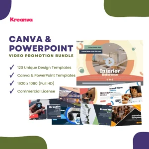
This premium collection includes professionally designed templates for business promotions, product showcases, social media marketing, presentations, and advertising campaigns. Simply customize the text, images, colors, and branding to produce high-quality promotional videos in minutes.
Whether you’re a business owner, marketer, freelancer, or content creator, these editable templates help you avoid common video design mistakes while maintaining a consistent and professional visual style.
👉 Explore the 120 Canva & PowerPoint Video Promotion Templates
Many promotional videos fail not because the product is poor, but because the presentation creates the wrong impression.
Fortunately, most video design mistakes are easy to avoid once you understand the principles of clean visual communication. By simplifying your layouts, maintaining consistent branding, using quality visuals, and focusing on clarity rather than excessive effects, you can create promotional videos that appear more professional and trustworthy.
Remember that effective video marketing is about communicating your message clearly while building confidence in your brand. A polished design helps viewers focus on what truly matters—your product, service, or message.