Physical Address
304 North Cardinal St.
Dorchester Center, MA 02124
Physical Address
304 North Cardinal St.
Dorchester Center, MA 02124

Logo design mistakes are common among beginners who are creating their first brand identity. Many new entrepreneurs and designers understand that a logo is important, but they often underestimate the strategy, planning, and design principles required to create a professional result.
A logo is not just a visual symbol. It represents a business, communicates brand values, and helps customers recognize a company among competitors. A well-designed logo can build trust, improve brand awareness, and create a stronger professional image.
However, many beginners focus only on making a logo look attractive without considering important factors such as simplicity, scalability, readability, and consistency.
These mistakes can make a brand appear less professional and reduce the effectiveness of its visual identity.
The good news is that most logo design mistakes can be avoided by understanding basic design principles and following a structured creative process.
In this guide, we will explore ten common mistakes beginners make when designing logos and provide practical tips to help you create a stronger and more professional brand identity.
A logo is often the first visual element people notice about a business.
Whether it appears on a website, social media profile, product packaging, presentation, or marketing material, a logo helps create an immediate impression.
A professional logo can help businesses:
A memorable logo makes it easier for customers to identify and remember a brand.
Strong visual identity helps businesses stand out in competitive markets.
Customers often associate professional designs with trustworthy businesses.
A poorly designed logo can negatively affect how people perceive a company.
A good logo can be used across different platforms while maintaining a consistent brand appearance.
This includes:
Understanding these benefits helps beginners avoid creating designs that look attractive but fail to support business goals.
One of the most common logo design mistakes is making a logo too complex.
Beginners often try to include too many elements, colors, icons, and details because they want the logo to communicate everything about the business.
However, complex logos can become difficult to recognize and remember.
A strong logo usually follows a simple principle:
A good logo should communicate a clear idea with minimal elements.
Simple designs are easier to use across different platforms and remain recognizable even in smaller sizes.
Color plays an important role in branding, but using too many colors can make a logo look unorganized.
Beginners sometimes choose multiple colors because they want the design to appear more creative or unique.
However, professional logos usually use a limited color palette.
A better approach is:
For example, technology brands may use modern colors, while creative brands may use more expressive combinations.
Typography can strongly influence how people perceive a brand.
Using inappropriate fonts is one of the common logo design mistakes that can make a business appear less professional.
Examples:
A good logo should use typography that matches the brand message and remains readable in different sizes.
Design trends can provide inspiration, but blindly following trends can create problems.
A logo that depends heavily on temporary styles may quickly become outdated.
Beginners should focus on creating a timeless design that represents the business rather than simply copying popular styles.
A strong logo should still look relevant years after it is created.
A logo needs to work in different sizes.
Many beginners design logos only for large screens and forget that logos may appear in smaller formats.
A logo should remain clear when used on:
A scalable logo maintains its visual impact across different applications.
Another common mistake is using low-resolution images or unsuitable graphic elements.
A professional logo should use high-quality design elements that remain sharp when resized.
Using low-quality graphics can make a brand appear unreliable and unprofessional.
Whenever possible, beginners should use:
A logo should represent the audience a business wants to attract.
One of the biggest logo design mistakes is creating a design based only on personal preference.
A logo for a children’s brand will have different characteristics from a logo for a financial company.
Before designing, consider:
Understanding the audience helps create a more effective logo.
Beginners often add shadows, gradients, 3D effects, or excessive decorations to make logos look more impressive.
However, too many effects can reduce clarity and make the design harder to use.
Professional logos usually prioritize:
A clean design often creates a stronger brand impression.
A common mistake is creating only one logo format.
Businesses often need different versions for different situations.
Examples:
Creating multiple versions improves flexibility and ensures consistent branding.
The final mistake is focusing only on appearance without considering the purpose behind the logo.
A logo should support the overall brand strategy.
Before creating a logo, beginners should understand:
A beautiful logo that does not represent the brand effectively may fail to create a meaningful connection with customers.
Avoiding these logo design mistakes requires a more strategic approach.
A better logo design process includes:
Understand the business, target audience, and competitors before designing.
Develop several ideas instead of immediately choosing the first design.
Remove unnecessary elements and keep the design clear.
Check how the logo looks on websites, social media, documents, and other materials.
Feedback from others can reveal problems that may not be obvious during the design process.
A structured process helps beginners create logos that are not only visually appealing but also meaningful and functional.
Building a professional brand doesn’t stop with a logo. To help you create a stronger visual identity, we’ve prepared a growing collection of free branding resources that you can download and use for your personal projects.
Explore these free resources:
Need a larger collection for your branding projects?
The 100 Premade Logo Templates Collection includes 100 professionally designed logo templates in AI and PSD formats.
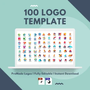
This collection is perfect for entrepreneurs, freelancers, and graphic designers who want high-quality logo concepts that are easy to customize.
Inside the bundle, you’ll find:
Whether you’re launching a new business or working with clients, these templates help you create professional logos in less time — without the logo design mistakes that can cost you revisions, time, and credibility.
👉 Explore the 100 Premade Logo Templates Collection
Looking for the ultimate branding resource?
The 1000 Professional Logo Templates Collection features 1,000 editable logo templates available in AI, EPS, PSD, and JPG formats.
The bundle covers more than 42 business niches, including:
Whether you design logos for your own business or for multiple clients, this comprehensive library gives you a wide range of professionally crafted concepts that can be customized quickly and efficiently.
Instead of starting from scratch, simply choose a template, personalize it, and create a polished brand identity in minutes.
👉 Explore the 1000 Professional Logo Templates Collection
Creating a professional logo requires more than choosing attractive colors and adding creative elements.
Many beginners make logo design mistakes because they focus on appearance without considering branding principles, usability, and long-term goals.
By avoiding complicated designs, choosing appropriate typography, understanding audiences, and creating scalable visuals, beginners can build stronger brand identities.
A good logo should be simple, memorable, flexible, and aligned with the business it represents.
With the right knowledge and design approach, anyone can create a logo that helps their brand look more professional and recognizable.