Physical Address
304 North Cardinal St.
Dorchester Center, MA 02124
Physical Address
304 North Cardinal St.
Dorchester Center, MA 02124


Your brand is often one of the first things potential customers encounter before they decide whether to learn more about your business.
They may see your website, social media profile, logo, promotional graphics, presentation, email, or product packaging. Each interaction contributes to the overall impression they form about your business.
This is why branding mistakes can have a bigger impact than many business owners realize.
A business doesn’t necessarily look unprofessional because it has a bad logo. Sometimes the problem comes from several small inconsistencies that accumulate across different customer touchpoints. A website may use one visual style while social media uses another. Promotional materials may feature different fonts and colors. The brand may also communicate with a completely different tone from one channel to another.
These inconsistencies can make a business appear less organized and harder to recognize. Brand consistency helps create a more coherent experience across platforms and can support familiarity and trust. ([1])
The good news is that many branding problems are relatively easy to identify and improve.
In this guide, we’ll explore 10 branding mistakes that can make your business look unprofessional and discuss practical ways to avoid them.
One of the most common branding problems is inconsistency.
Your website might use one color palette, your social media another, and your promotional materials a completely different visual style.
When customers encounter these different versions of your business, they may have difficulty connecting them to the same brand. This branding mistake can weaken recognition and make your business appear less organized.
A consistent visual identity doesn’t mean every design needs to look identical. Instead, important elements such as colors, typography, imagery, logo usage, and general design style should work together across different channels. ([1])
How to avoid it: Create a simple visual identity system and use it consistently across your major marketing channels.
A logo is important, but it is only one part of a brand identity.
Some businesses spend most of their branding effort trying to create the perfect logo while ignoring other elements such as typography, colors, messaging, imagery, and customer experience.
A strong brand needs a broader system that helps customers understand what the business represents.
How to avoid it: Build your brand identity around multiple connected elements rather than relying on the logo alone.
Typography can quickly make a brand look either polished or chaotic.
Using several unrelated fonts throughout your website, social media graphics, presentations, and promotional materials can make your visual identity feel inconsistent.
A simple typography system is usually easier to maintain and helps prevent this branding mistake from affecting your marketing materials.
How to avoid it: Select a small number of complementary fonts and define how each should be used.
For example, you might have one font for headings and another for body text.
Color can help customers recognize a brand, but using too many unrelated colors can weaken that recognition.
A business doesn’t need a completely different color combination for every campaign.
How to avoid it: Establish a primary color palette and a few supporting colors. Then use seasonal or campaign-specific colors carefully without losing the overall identity.
Looking at competitors can help you understand your market, but directly copying their visual style is a branding mistake that can make your business look generic.
If your logo, colors, typography, messaging, and overall presentation resemble another established brand too closely, customers may struggle to understand what makes your business different.
How to avoid it: Research competitors to identify opportunities for differentiation rather than simply imitating their aesthetic.
Starting every design project from a blank canvas can create unnecessary work and increase the likelihood of inconsistency.
One social media post might use one layout, while the next uses completely different typography, spacing, and visual elements.
Reusable templates can solve much of this problem.
Editable templates provide a framework that allows businesses to create new content while maintaining consistent visual and messaging standards. ([1])
How to avoid it: Build a library of reusable templates for common marketing materials.
Without clear brand guidelines, different people may interpret your brand differently.
A designer may choose different fonts. A social media manager may use another color palette. A freelancer may create graphics based on personal preferences.
Over time, these small decisions can gradually weaken brand consistency.
Brand guidelines provide a reference for how a brand should look, sound, and communicate across different touchpoints. ([2])
How to avoid it: Create a simple brand guide covering your logo, colors, typography, imagery, tone, and basic usage rules.
Images communicate a lot about a business.
Low-resolution graphics, poorly cropped photographs, unrelated stock images, or inconsistent illustration styles can make otherwise good branding feel less polished.
Your visual content should support the personality and positioning of your business.
How to avoid it: Establish a consistent image direction and use high-quality visuals that are relevant to your audience and brand.
Adding more elements doesn’t necessarily make a design more professional.
Too many fonts, colors, icons, decorative elements, messages, and competing visual focal points can make a design difficult to understand.
Professional branding often benefits from clarity and intentionality.
How to avoid it: Remove unnecessary elements and create a clear visual hierarchy. Give important information enough space to stand out.
Branding needs room to evolve, but changing your visual identity every few months can make it difficult for customers to build recognition.
Frequent changes to your logo, colors, fonts, and messaging represent a branding mistake that can make the business appear uncertain about its identity.
A brand should be able to adapt while maintaining recognizable foundations.
How to avoid it: Make intentional brand updates when there is a clear strategic reason, rather than changing your identity simply because a new design trend becomes popular.
Most of these errors have one major thing in common: they stem from a lack of consistency. In fact, visual and message inconsistency is perhaps the most widespread branding mistake a business can make.
A professional brand is not necessarily the one with the most expensive design. It is often the one that communicates a clear identity consistently across different customer touchpoints.
Your website, social media profiles, emails, presentations, advertisements, and other marketing materials should feel as though they belong to the same business.
This is why a brand style guide and reusable templates can be valuable. They turn branding decisions into a repeatable system instead of leaving every design decision to individual preference.
Avoiding common branding mistakes is only the first step. The next step is creating a system that makes consistency easier to maintain.
You don’t need a complicated branding manual to get started. A simple set of rules can already make a significant difference.
Start by defining your:
Once these elements are established, apply them consistently across your website, social media, presentations, promotional materials, and other customer-facing content.
The objective is to make your brand easier to recognize without making every piece of content look exactly the same.
Reusable templates can make professional branding much easier, especially for small businesses and solo entrepreneurs.
Instead of creating every social media post, presentation, promotional graphic, or marketing material from scratch, you can create a collection of templates that already follow your brand identity.
For example, a business might maintain templates for:
This approach reduces repetitive design work while making it easier to prevent a branding mistake caused by inconsistent design choices.
Templates can also be useful when multiple people contribute to your marketing. Rather than allowing everyone to create designs based entirely on personal preferences, templates provide a common visual foundation.
Brand consistency should be evaluated across the entire customer journey.
Take some time to look at your:
Do they look like they belong to the same business?
If your Instagram profile looks modern and professional but your website uses completely different colors and typography, customers may experience a disconnect.
A simple visual audit can reveal inconsistencies and help you catch a potential branding mistake before it affects your customer relationships.
The collection includes 100 premade logo templates in AI and PSD formats, covering a range of general business niches.
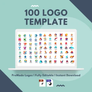
These templates can be useful for:
You can use the collection as a source of inspiration or as a starting point for developing a visual identity that fits your business and target audience.
👉 Explore 100 Premade Logo Templates
If you’re working on your brand identity and looking for practical design resources, explore the freebies section in this blog.
You’ll find free digital resources that can help with branding, design, marketing, content creation, and other digital projects.
These resources can provide useful starting points when you need to create professional-looking content without designing everything from scratch.
👉 Explore the Freebies Section
It’s tempting to focus on advertising, social media growth, and promotional campaigns before establishing a consistent brand foundation.
However, scaling an unaddressed branding mistake across multiple marketing channels will only make the problem much more difficult and expensive to fix later.
Before producing a large volume of marketing content, establish a basic visual identity and create reusable assets that reflect it.
This gives future content a consistent direction and can make it easier to maintain your brand as your business grows.
A strong brand system doesn’t have to be complicated. What matters most is that it is clear, practical, and consistently applied.
Avoiding common branding mistakes can make a significant difference in how professional and trustworthy your business appears.
You don’t need an expensive rebrand to improve your presentation. Start with the fundamentals: establish consistent colors and typography, use appropriate imagery, simplify your designs, create clear guidelines, and develop reusable templates.
Most importantly, remember that branding is a system rather than a single logo.
When the different elements of your business communicate the same identity across your website, social media, marketing materials, and other customer touchpoints, your brand becomes easier to recognize and more professional.
Consistency is what turns individual designs into a recognizable brand.